mobile rabbit 4.0
hopping right in
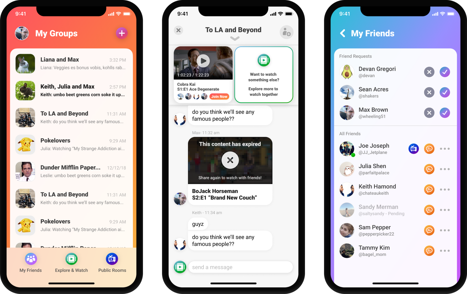
when i started at rabbit the product team had determined the new feature set and the overall direction for the next generation of Rabbit. before this release, the app and website were focused solely on the public room experience. they had reached around 3M MAU but the day 1 retention was lacking, they decided to double down on the private watch experience which consisted of adding a group chat to the platform as well as integrating content from premium providers like Netflix, Hulu, Amazon Prime and more.
part of our launch
campaign for mobile 4.0
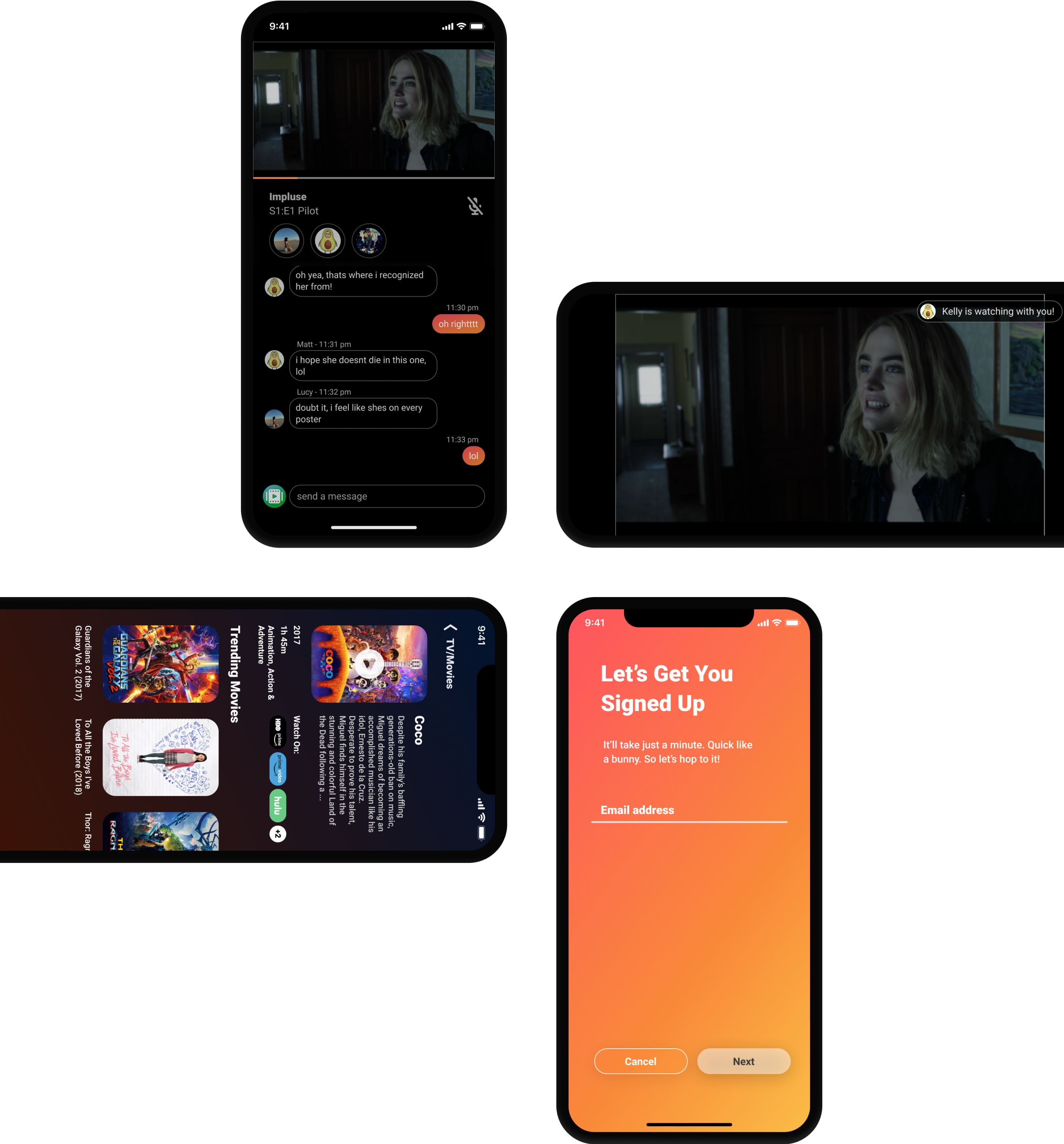
a new start
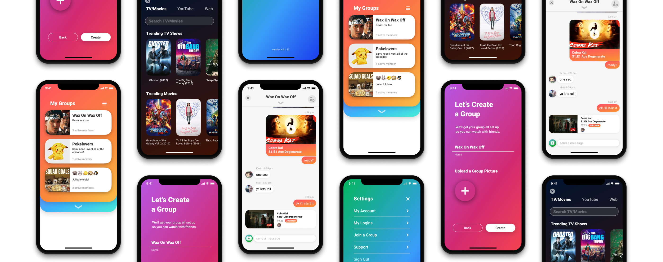
i started by creating the main screens for the app to help me understand the feel of the app. i wanted to go with something bright and cheerful using color to help guide and aim the user to where they were in the app. after fleshing out such screens as the home page, settings, create a group, launchpad and the group chat. from there, i had enough components and variety to finish out the rest of the screens including the watch experience. once the majority of screens we did a round of user testing which informed some visual and interaction details in the released app
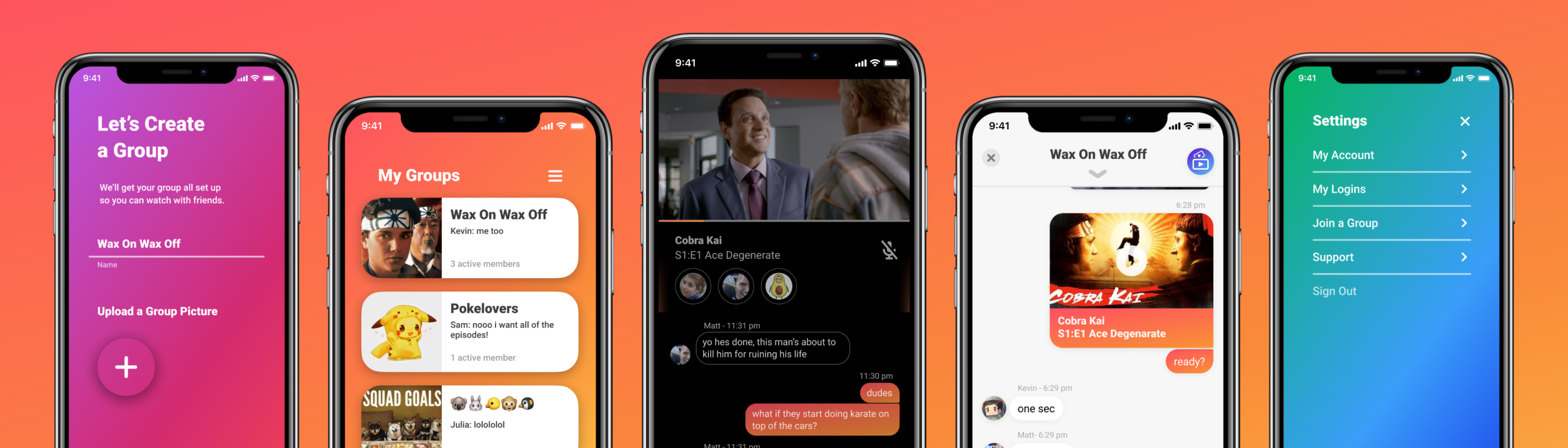
sharpen the point
after the main style was adopted by the company stakeholders, I started working on improving the icons throughout the app. I had put the icons to the end of the process as they are easy for the engineers to replace at the end. There were a few icons which were a challenge like the launchpad and the public rooms. these required just good old iteration and exploration to get icons which both communicated the concept and were visually consistent with each other.
be right back
once the mobile designs were finished and the development started, i started to get a head start on the web version of the 4.0 release. I had to take the visual style i designed for a mobile interface and apply it to a new web platform to try to merge the very distinct products. the 4.0 release was a big step to making the two platforms feel more like one product.
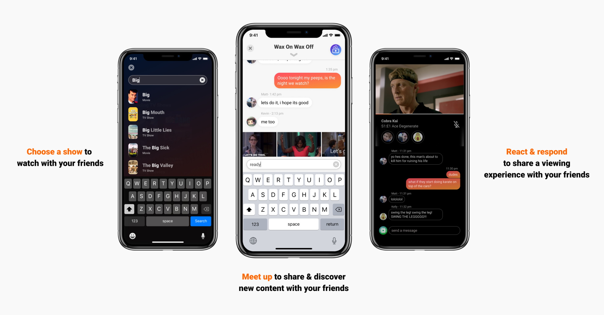
circling back
once the mobile release was finished, i moved on to the web platform. after the majority of the web work was complete i then came back to the mobile platform to make some changes to better align with the web client but also to add back a friends feature. these adjustments moved the mobile client forward in clearer UX but also leads into the larger navigation changes we put in place after with the library and watch tab.